Inspiration Article
Masterclass: How To Choose Luxury & Vintage Paint Colours

If you’re looking for a luxury colour palette for your home, look no further. Heritage is a range of 112 durable vintage paint colours, updated and refreshed for today’s modern homes. These are extraordinary paints for everyday lives, offering colours that will make your home look beautiful for many years to come.
For 90 years, Dulux has stood for durable luxury and the Heritage range encapsulates the proud history of our brand. Each paint is formulated with premium quality pigments and specially blended clays, so not only is it a dream to apply it gives you a velvety soft-to-touch matt finish. And because it’s a washable paint, Heritage is tough enough to withstand everyday life.
It means you can give your home a luxury colour palette that lasts – year after year after year. Plus, Heritage is backed by the Dulux Promise, meaning you’re guaranteed to get the colour and consistency you’ve always wanted, or we’ll replace your paint.
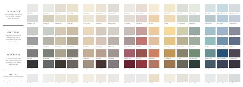
If you’re wondering how to choose paint colours from the Heritage range, it’s really easy. This luxury colour palette is organised into pale, mid and deep tones, each one paired with the perfect, complementary white. Every single shade in the Heritage range has a story to tell, which helps you tell a story within your own home.
Explore the Heritage colour card
The Heritage colour palette has been designed to make it easy for you to choose your perfect colour. It works in columns moving from cool greys and warm neutrals, to reds, greens and blues in a familiar flow that follows the colour wheel. At the bottom of each column, you’ll find the perfect white to complement your chosen colour.
How to create a tonal colour scheme
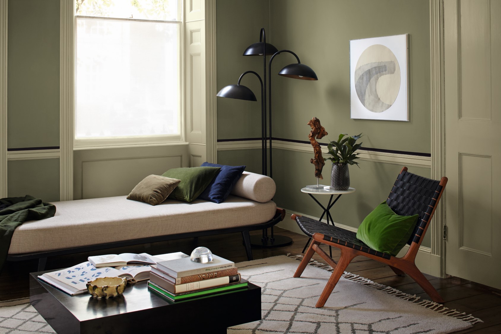
The simplest way to choose Heritage colours is to pick one predominant colour, then team it with the complementary white at the bottom of the column. But to take it on a step, experiment with tones. Pick a main colour for your walls, then use other shades from the same column to decorate different elements of the room. Here we teamed DH Drab with Olive Tree to create a living room that feels airy and calm.
How to create a harmonious colour scheme
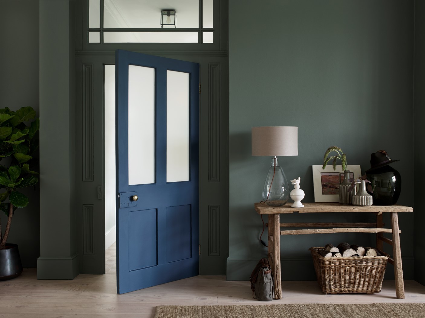
Colours that lie next to each other on the Heritage colour card can be used in combination to create a subtle layered effect. Choose shades from different columns to use across different elements of your room – from walls to flooring, furniture to accessories. Here we’ve paired Waxed Khaki with Midnight Teal to create an inviting and harmonious hallway.
How to create a contrasting colour scheme
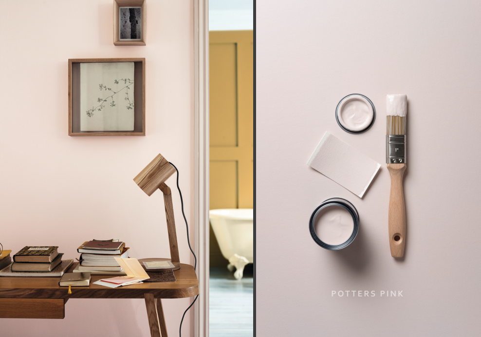
Colours that lie opposite one another on the colour wheel can create the most dynamic, contrasting colour schemes. For example, green against red, or orange against blue. Look at the way the Potters Pink sits beautifully against the Brushed Gold in the background, creating a colourful vibrancy that draws you from room to room.
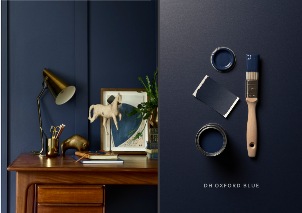
Create a calm study space in deep, sumptuous navy
Looking for vintage room ideas? One of our favourite Heritage hues is DH Oxford Blue, which is so rich and velvety it’s perfect for a modern home office. It works wonderfully in combination with neutrals like Edelweiss White and Quartz Grey, or with soft shades like Potters Pink and Setting Stone.
Bring the outdoors in with this botanical green
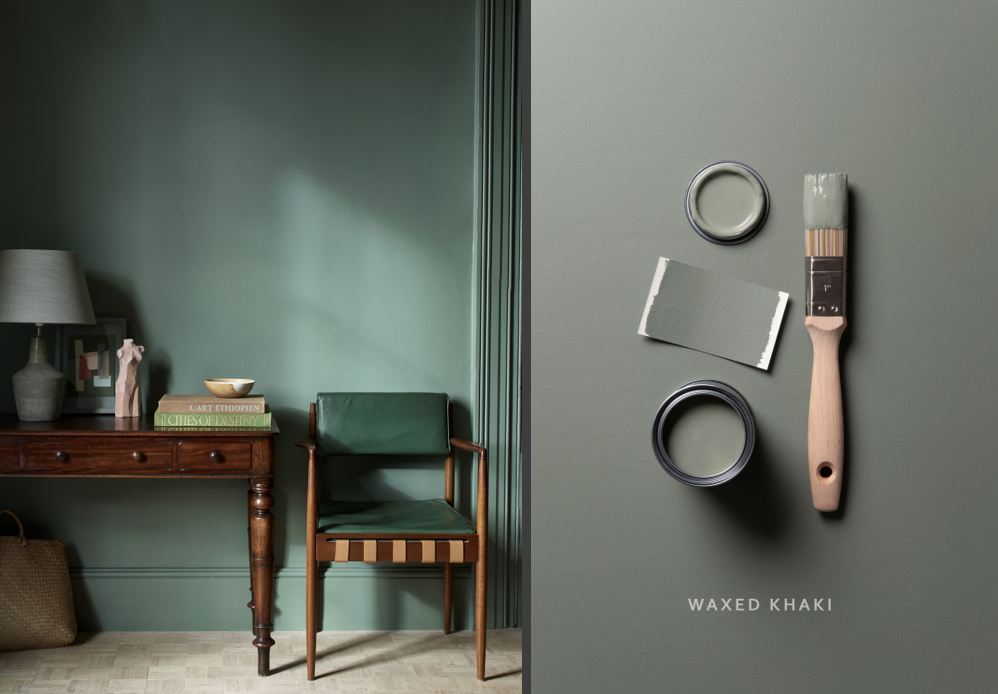
Waxed Khaki is one of those colours that captures the great outdoors. And yet, when you paint it onto the walls of your home, you get this sense of relaxed tranquility. Go for a tonally harmonious palette by pairing it with Stone Green and Green Slate, or create a colourful contrast by bouncing it off Veranda Green and Midnight Teal.
Create a laidback light and luxurious room
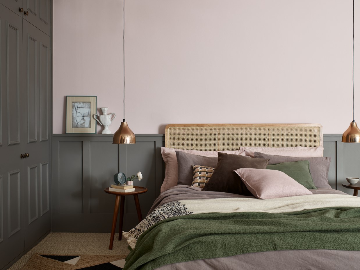
Potters Pink transports you to an Edwardian cottage garden when the flowers are in full bloom. Quite simply, it’s a breath of fresh air that feels both nostalgic and joyful. Go for a luxury colour palette, by pairing it with harmonious tones such as DH Blossom and Coral Pink, or create a contrast as we have here using Mud Lark on the woodwork for a striking yet laidback look.
Make a corner of the room feel cosy and intimate
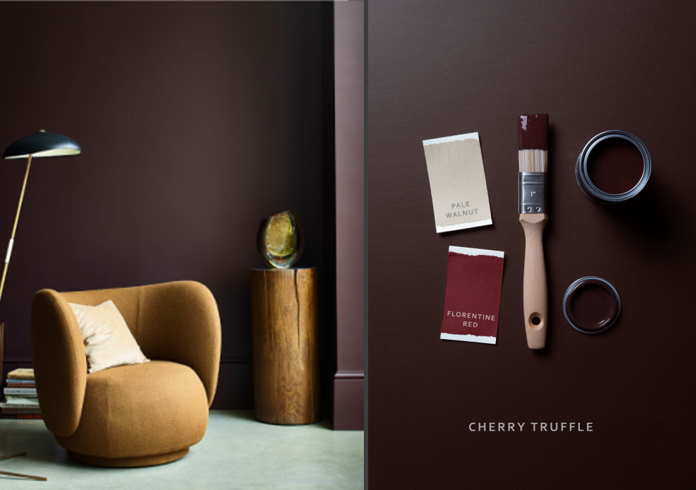
Cherry Truffle is a deep, rich chocolate tone, which lends your space a warmth that feels both dramatic and inviting. Considering how bold a shade it is, it’s surprisingly versatile, creating cosy and comforting bedrooms, study rooms and kitchen diners – or even just a reading corner. Balance it with tonal friends like Pale Walnut and Candle Cream, or pep it up with Florentine Red, Pugin Red or Masters Gold to make your vintage room ideas come alive.
For more advice on Heritage colours and how to style them, discover the complete Heritage range here.